Wednesday, January 29, 2014

Update - Tower of David


The Oct 20th, 2013 blog entry 'Random picture - Tower of David' showed a picture of the "Tower of David" - described as: ".... a looming and dilapidated structure that he describes as “a ziggurat of mirrored glass topped by a great vertical shaft, [rising] forty-five stories above the city.” The Tower, which can be seen from almost anywhere in Caracas, is a symbol of the downward spiral that Venezuela has experienced under Hugo Chávez’s rule." Slumlord described "... the world's tallest slum..." and a place "... of prison-style executions, of people being mutilated and their body parts thrown off the upper floors." 

Now 'A Tower Transformed' puts it in a much more positive light, as "... a complex and fascinating place: not just a symbol of poverty, but a symbol of the self-organized activity that offers a way out of poverty. It isn't the development that David Brillembourg envisioned, but it isn't a Ballardian hellscape either. It's more of a messy testimonial to human creativity and survival: ragged, flawed, inventive, and amazing."

Tuesday, January 28, 2014

NEC Medias W N-05E first look


Popped for an unlocked NEC Medias W N-05E on eBay... These came out in Japan in the first quarter of last year (2013) and haven't been a huge hit, the 2-screen form factor has never really caught on... Mostly this has been because the software hasn't really taken advantage of the two screens, often just giving one the ability to toggle the display across the two screens. This has invariably prompted "Waah, the join between the two screens is really disconcerting" reactions! Which is true in certain cases e.g. reading a book spread across the two screens, but not so much in others...

Anyway, it had been a while since my last gadget splurge, so I caved to the urge to get my hands on one!

The specs:
OS: Android 4.1 Jelly Bean
CPU: Qualcomm Snapdragon S4 MSM8960 Dual-core 1.5GHz
GPU: Adreno 225 RAM: 1GB ROM: 16GB
Dimensions: 136×64×12.2mm
Weight: 183g
Display: 4.3in, LED of TFT ×2, Multi-Touch Capacitance Resolution: 960×540 qHD
Camera: 8.1MP (Back-side CMOS) LED Flash
Connectivity: W-CDMA(800/850/2100MHz, GSM(850/900/1800/1900MHz), WiFi 802.11 a/b/g/n, Bluetooth 4.0
Sensors: GPS, G-Sensors, Digitalcompass,Proximity Sensor, Light Sensor
Miscellaneous: microSIM, microSD(Max 32GB), microUSB, 3.5mm-Audio Jack
Battery: Li-Ion: 2100mAh

And then the pictures:


Comparisons are in order, so here (from left to right) are the Blackberry 9810 Torch 2, the Samsung Galaxy S4, an Apple iPhone 4S, and the Medias N-05E.


And from bottom to top - the Samsung Galaxy S4, the iPhone, the Torch 2, and the Medias N-05E:


The Medias N-05E next to the Galaxy S4, in single screen and double screen modes:


Sitting on an unlit Sony Tablet P:


And, finally, next to a Zaurus SL-C3200:


Some screen shots in single- and dual-screen modes (Note: when you take a screen shot you can take the main screen, the 'extension' screen, or both screens. When you do the latter the screen captures you see don't include the border between the two screen....)


And the very preliminary first impression? I like the look and feel! Of course, I'm a keyboard lover, which is why the Zaurus is still my computing mainstay, supplemented by a BB (also with a keyboard) for all the wireless functionality...  No good feel for battery life yet either, and not sure what to do for a case, since when folded both screens face outward! But for the first day this is as far as I've been able to go... Stay tuned more to come...

NEC Medias w N-05E reviews:
NEC N-05E page (in Japanese) 
User's Manual for docomo NEXT series MEDIAS W N-05E

Video Review: NEC Medias W N-05e 
NEC Medias W Docomo N-05E reviewed! (Many videos, in Russian) 
NEC's Medias W global prototype spotted: 4.3-inch Android phone or 5.6-inch tablet?

Monday, January 27, 2014

Six years of blogging


So today is the 6th anniversary of my first blog post (on the assassination of Benazir Bhutto). As stated in the 'On This Blog' section, the blog consists of random chart and random picture entries, as well as "SNi's entries - politics, gadget reviews, plus anything that strikes his fancy."

A very small readership. However, I'd like to think that at least some of the blog entries have interesting things to say and are worthy of review, such as those related to hospitals and healthcare, my multiple gadgets, and occasional musings on politics.

Looking at the Google stats it doesn't look like these are read very much! For some unknown reason a random chart entry about cigarette brands has racked up the most hits, with folks coming from all over the world to that blog entry! Very bizarre indeed! However, the "from all over the world" is sort of cool...


Sunday, January 26, 2014

Agenda?

In 2013 and following its Brill "expose" on healthcare pricing, TIME also published an infographic: What Makes Health Care So Expensive? (see below).


The infographic had a few questionable things, as pointed out by others e.g. see the below. For example their definition of "Operating Profit" was somewhat unique, and seemed chosen so as to cast the hospitals in a more unfavorable light than perhaps they deserve!


This month another article, 'Hate Obama, Love Obamacare', looked at the PPACA ("health care reform") and the implementation of its health exchanges and insurance products.  It chose a family to highlight (apparently) the benefits of the law and the positive effect it has had on the insurance needs/coverage for one family, the Recchis. However, after reading the article one wonders why TIME couldn't have found a much better example to use... (they exist by the hundreds of thousands!) It seems like it would have been simpler than torturing the facts  as the article appears to do.
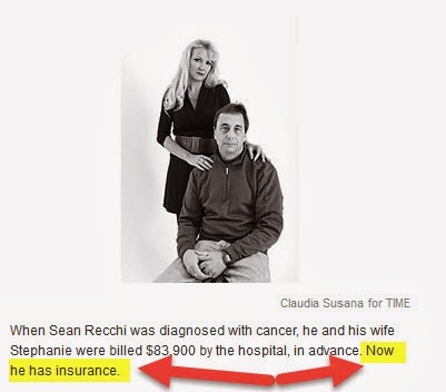
  • Even before the article starts there is a problem with the setup. The picture of the family at the top of the article has a caption - "When Sean Recchi was diagnosed with cancer, he and his wife Stephanie were billed $83,900 by the hospital, in advance. Now he has insurance." Reading this I naturally assumed (as would presumably almost everyone who read the caption)  that Sean Recchi in fact did not have insurance when he sought care at  the MD Anderson Cancer Center in Houston. However, reading on this is NOT the case, see: "When he was diagnosed with cancer, Sean's policy limited his coverage to $2,000 a day in the hospital, which at MD Anderson barely covers an opening round of blood tests.)" Strange.
  • Further on in the article TIME implies that the Recchi's pre-PPACA insurance policy was an example of 'bait and switch' - "... none of which would be allowed to have the bait-and-switch limits that had left Sean unprotected when he needed lifesaving care." Unless they were sold the policy being told that it would cover 100% of 'out-of-network' expenses (an Ohio patient seeking care at M.D. Anderson in Houston, Texas) which then turned into $2,000/day, this is a new and novel definition of 'bait and switch.' And one could also quibble about the use of "unprotected."

  • The article then goes on to provide insufficient information to really understand if the Recchi family found "better" insurance post-PPACA. All we really have in the way of information on their pre- and post-PPACA insurance plans is:

    • Pre-PPACA: $469/month, plan covered $2,000 per day for "out of network" hospitalization at M.D. Anderson.
    • Post-PPACA; $793/month,  $12,000 deductible, plan provides no coverage for "out of network" hospitalization at M.D. Anderson. (Note: This looks at the cost of the insurance plan, because even if it is subsidized by the government so that the Recchis pay less, the policy still runs $793 per month!)

  • Finally, the Recchis end up being covered by Ohio Medicaid, at no cost to them (premium). Here Brill then throws in a 'Well, if John Kasich hadn't opted-in to the PPACA Medicaid state expansion' then blah, blah, blah.... Huh, rather than tossing in a hypothetical situation how hard would it have been to find a real example of a family that actually was hurt by residing in a state in which a Republican governor opted out of the Medicaid expansion? Again, there are hundreds of thousands!
The bottom line? To this blogger it appears that Brill chose to highlight this particular family mainly because they were willing to go on record as initially being against 'Obamacare'  before they saw the light and realized it was actually a blessing! This blogger's take away is different - first, the Recchis appear rather ignorant - first being against 'Obamacare' because "they were clearly people who don't like the President," and second, apparently having no idea what 'Obamacare' actually entailed (as reflected by their ignorant statement "it doesn't cover pre-existing conditions and it's too expensive..", etc. Third, they apparently are quite willing to flaunt their ignorance! Note that instead of taking ownership of their ignorance it is brushed off as due to "a lot of talk," as if the facts were not readily available to them and being repeated daily by those in favor of the PPACA!

Well have the Recchis wised up and become more reticent about displaying their ignorance for all to see? Unfortunately it appears not... "Here I get full protection for $566, compared to no protection for almost $500," Stephanie says, referring to her old plan that had cost $469 monthly and that MD Anderson had scoffed at. "This is wonderful." Aargh!

And TIME? Well, they appear to want to go beyond the facts... Agenda, anyone? Perhaps the Recchis are TIME subscribers!

Random chart - China ADIZ

Click to enlarge:


Recently in the news, China declared an Air Defense Identification Zone (or ADIZ) in the Easy China Sea, and started a kerfuffle... with neighbors Japan and South Korea, and with their backer the U.S.

Saturday, January 25, 2014

Random picture - T4 bacteriophage


Source: Beautifully Accurate Glass Sculptures of Deadly Viruses A web site with "... a collection of glass sculptures accurately depicting some of the most prevalent viruses out there, including HIV, malaria, and the swine flu (notoriously recognized in the 2009 flu pandemic)."  Go there for the full picture of the T4 bacteriophage and others....

Thursday, January 23, 2014

Random chart - WEF, Davos


A small portion of the Economist's infographic on attendees at the World Economic Forum in Davos, Switzerland. One data point: "... after all the inflated expenses and egos, what has been the fate of the companies that sent delegates at least three times in the past five years? Those 104 firms underperformed both the S&P 500 and MSCI World Index."

Random chart - inequality


Tuesday, January 21, 2014

FDA consumer app


The FDA's Medwatch program is its "gateway for clinically important safety information and reporting serious problems with human medical products." Recently the FDA has worked on their web site to make it more user-friendly and has also attempted to make it it easier for consumers to report problems with approved drugs, vaccines, and devices... developing, for example,  its Consumer Voluntary Reporting Form.

Now it has released an app, Medwatcher, available for iOS and Android and downloadable from the iTunes App Store and Google Play Store. Per the FDA

"MedWatcher is a mobile application (app) that allows individuals to submit voluntary reports of serious medical device problems to the FDA using a smart phone or tablet. The app makes it easier and faster for healthcare professionals, patients and caregivers to send voluntary reports of medical device problems to the FDA, compared to the traditional reporting methods - mail, phone or online. The MedWatcher app allows users to upload photographs of medical devices, which can help identify visible problems with the device, such as breakage or corrosion. App users can also choose to automatically receive MedWatch Safety alerts, FDA safety communications, recall information, relevant articles and other information on specific medical products of interest."

After registration and login you can  search the library of drugs, vaccines, and devices; pick the ones you have an interest in; and add them to a Watch List. From the watch list you can get further  item details, etc. The app then provides you a (searchable) news fed of entries related to the items on your watch list.

You can  also report problems with any of your drugs, vaccines, or devices using a simple 5-step process - pick what you are reporting on; provide product and diagnosis info (with optional ability to add/submit a photo); provide the date, a description of what happened, and  pick outcomes from a pre-defined list; provide patient age and sex; finally provide reporter information; then submit. 

Below are screen shots on a Samsung Galaxy S4, and from the desktop web site...


Pretty cool.

Random charts - emergency care


Monday, January 20, 2014

Great quotes - dual govt?


"... Les Gelb, former president of the Council on Foreign Relations and an Assistant Secretary of State in the Carter Administration, later explained his initial support of the Iraq War as  “symptomatic of unfortunate tendencies within the foreign policy community, namely the disposition and incentives to support wars to retain political and professional credibility.” One must always retain credibility, which counsels against fighting losing battles at high credibility costs, particularly for a policy option that would play in Peoria as a weak one.  Whether the policy is in reality the most effective is beside the point. It is the appearance that matters, and in appearance, the policy must seem hard-hitting. That reality permeates national security policy-making..."

- Michael J Glennon, Professor of International Law, Fletcher School of Law and Diplomacy, Tufts University, in National Security and Double Government (114-page PDF. In this article he seeks to explain the continuity (for the most part) in national security policy despite a change of Presidents (from Bush to Obama). 

One possible answer to the plaintive laments I often see, in which bloggers and others ask how the folks that were so wildly wrong on any number of issues still have their utterances treated as serious, while those of the people who counseled against the direction taken on those issues (and who were ultimately proved to be right!) are not...

Add it up...


Much ink has been spilled discussing spending on healthcare and health outcomes, especially the apparent disconnect between the two in the U.S. (i.e. we are spending more but achieving less....). Multiple reasons have been put forward, e.g. see my 'So, how bad is it (healthcare)?' blog entry, which spends some time on this subject...

The blog entry 'Random charts - child health' highlights Time to Act: Investing in the Health of Our Children and Communities. Recommendations From the Robert Wood Johnson Foundation Commission to Build a Healthier America (120-pg PDF), which declared that "In their search for solutions, the Commissioners found that there is much more to health than health care and that where we live, learn, work, and play profoundly influence our health..." 

Add it all up and throw in 'Inequality Is At The Core Of High Health Care Spending: A View From The OECD' and you have a fairly compelling argument that "...It is difficult not to connect the dots from inadequate social spending to excess poverty and income inequality to more chronic illness and higher health care spending"